Your YouTube thumbnail is the first impression viewers get before deciding to click. Studies show that optimised thumbnails can increase click-through rates by 30-50%. This guide breaks down the top thumbnail strategies used by viral creators across industries, with actionable insights for your channel.
1. SHOCKED FACE + NUMBER
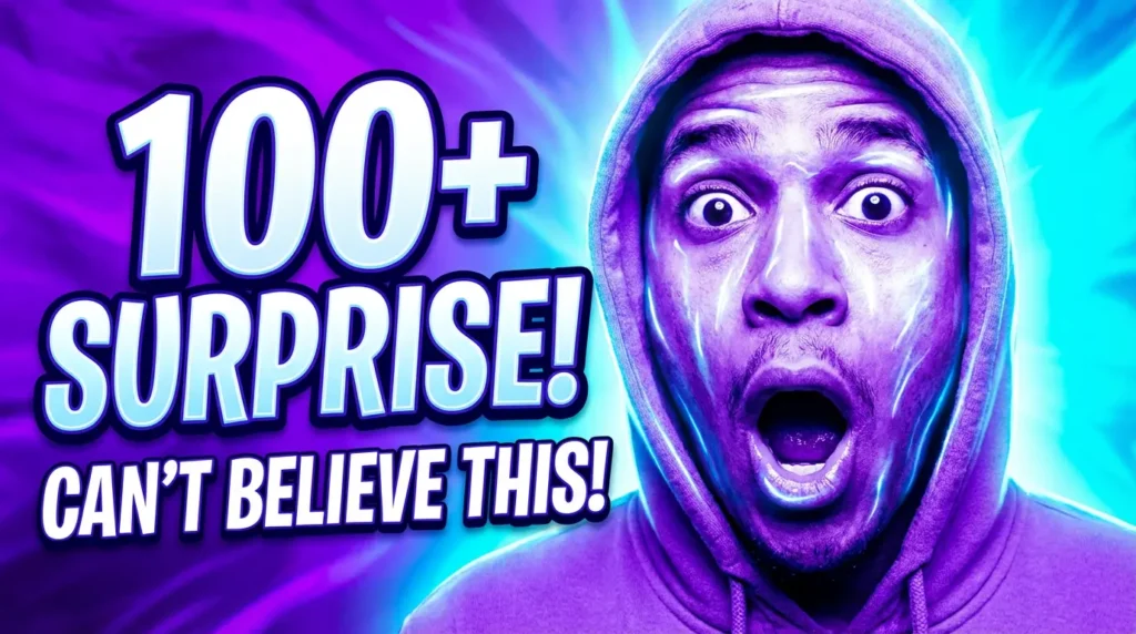
Why It Works: Emotional expressions create immediate psychological response. Large numbers trigger curiosity and create promise of value or urgency.
Best For: Educational content creators, self-improvement coaches, fitness trainers, life hack channels, business mentors.
Who Should Use It: Beginners to intermediate creators wanting quick engagement boosts.
Pro Tip: Pair genuine emotion with achievable numbers (not unrealistic claims). Use contrasting colors behind the face; bright yellows, oranges, or reds work best. Keep the number size 20-30% of the thumbnail.
2. RED CIRCLE + ARROW
Why It Works: Directs viewer attention to key elements. Red triggers urgency and importance. Arrows create visual flow and guide eyes naturally.
Best For: Mystery/puzzle channels, comparison videos, technical reviews, product showcases, conspiracy/interesting facts.
Who Should Use It: Content creators who highlight specific details or want to draw focus to important elements.
Pro Tip: Don’t overuse circles—limit to 1-2 per thumbnail. Yellow or white arrows pop better on complex backgrounds than red.
3. SPLIT SCREEN COMPARISON
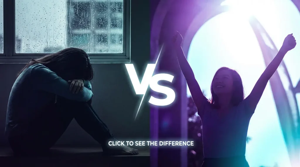
Why It Works: Visual contrast is instantly digestible. The brain processes two opposing images quickly. Creates natural “which is better?” question.
Best For: Comparison channels, lifestyle content, product reviews, before/after transformations, “good vs bad” content.
Who Should Use It: Creators comparing options, methods, products, or lifestyles.
Pro Tip: Use opposite emotions on each side (happy/sad, clean/messy, rich/poor). Maintain 50/50 split visually. Use contrasting color backgrounds—one warm, one cool. Add “VS” or question text in the middle.
4. CELEBRITY REACTION
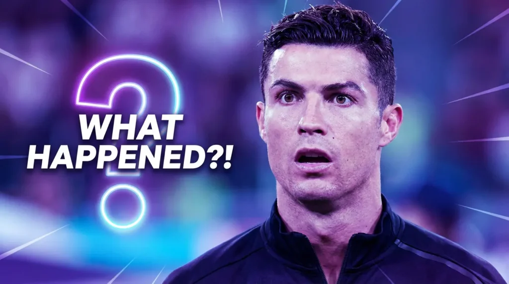
Why It Works: Fans want to see their favorite personality’s response. Familiar faces increase recognition and trust. Creates parasocial connection.
Best For: React channels, entertainment news, celebrity analysis, music reactions, movie reviews, pop culture commentary.
Who Should Use It: Channels that reference or feature celebrities, or channels with recognizable personalities.
Pro Tip: Use high-quality images of the celebrity’s most recognizable expression. Add question marks or “REACTS TO” text overlay. Keep their face as 60% of the thumbnail. Make sure you have rights to use the image or use your own reactions instead.
5. FORBIDDEN/LEAKED LABEL
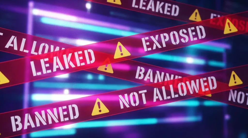
Why It Works: Creates FOMO (Fear of Missing Out). “Forbidden” or “Banned” content triggers urgency and curiosity. Scarcity psychology drives clicks.
Best For: Expose videos, mystery channels, conspiracy content, exclusive reveals, industry secrets, behind-the-scenes footage.
Who Should Use It: Creators sharing inside information, controversial takes, or exclusive access.
Pro Tip: Use bold red text with “LEAKED”, “EXPOSED”, “BANNED”, or “NOT ALLOWED” overlays. Add warning tape or danger symbols. Stay ethical—don’t use misleading labels if content isn’t actually banned or leaked. Build trust or face viewer backlash.
6. MONEY/NUMBERS FOCUS

Why It Works: Humans are attracted to financial content. Large numbers create aspirational feelings. Dollar signs catch attention instantly.
Best For: Finance channels, business tutorials, income reports, investment guides, side hustle content, wealth building.
Who Should Use It: Creators teaching money-making strategies or sharing financial results.
Pro Tip: Use bold, large numbers ($1M, $100K, 10X). Incorporate dollar signs, stacks of money, or bank statements. Keep numbers realistic and achievable or face credibility loss. Pair with a person’s face for added relatability.
7. QUESTION + FACE
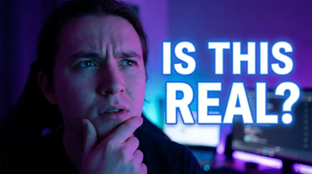
Why It Works: Questions trigger curiosity and cognitive engagement. Combined with confused or thinking expressions, viewers want answers. Creates an open loop.
Best For: Mystery content, educational videos, thought-provoking content, debates, controversial topics, how-to videos.
Who Should Use It: Creators posing interesting questions or challenging viewer assumptions.
Pro Tip: Pair confused faces with questions like “IS THIS REAL?”, “CAN THIS WORK?”, “WHY IS THIS BANNED?” Use bold text. Keep questions short and punchy (3-6 words max). Make sure the video actually answers the question or lose audience trust.
- Visual Hierarchy: Your most important element should occupy 50-60% of the thumbnail space.
- Color Contrast: Use complementary colors (red/cyan, yellow/purple, orange/blue) to make elements pop. Avoid similar color schemes.
- Text Readability: Keep text to maximum 3-5 words. Use bold, sans-serif fonts. Ensure 100% readability at 168x94px (YouTube's mobile size).
- Face Power: If using faces, they should be 30-40% of the thumbnail. Emotions and eye contact increase engagement by 40%.
- Consistency: Maintain visual consistency across thumbnails so your channel is recognizable in feeds. Use consistent font, color scheme, and style elements.
- A/B Testing: Test 2-3 thumbnail variations and track CTR. YouTube Studio shows which thumbnails perform best.